DTC Documentation System

INTRODUCTION

Welcome

Software development has followed the same pattern for decades: requirements are gathered, mockups are created, screens are designed, developers write code, and only after weeks or months does the client finally see how the application actually behaves. At that point, new requests appear, workflows change, assumptions prove incorrect, and the development cycle begins again.

This platform was created to challenge that model.

Instead of relying on static mockups or simplified prototypes, it allows applications to be modeled as living simulations. Real data structures, runtime instances, events, navigation flows, and business logic can be represented visually from the earliest stages of development. Clients are not shown an approximation of the final product—they interact with a realistic simulation of how the system will behave.

At the heart of the platform is a visual runtime model built around ClassInstances, ClassListInstances, PropertyInstances, BindPoints, Viewports, Flows, and Event Graphs. Data, user interfaces, navigation, and application behavior are connected through a unified visual architecture where components communicate using signals and bindings rather than isolated code fragments.

The goal is simple: reduce misunderstandings, shorten feedback cycles, and allow both technical and non-technical stakeholders to validate the product long before production code is generated.

But this is only the beginning.

Future releases will introduce AI-assisted application design and development. Intelligent agents will be able to collaborate with human developers directly inside the platform, helping create simulations, workflows, user interfaces, business logic, and application structures. Rather than replacing developers, these agents will work alongside them, accelerating repetitive tasks while leaving architecture, validation, and final decisions in human hands.

This collaborative model aims to solve one of the most common frustrations in software projects: discovering important changes only after significant development effort has already been invested. By combining realistic simulations, live data models, and AI-assisted design, stakeholders will be able to validate ideas much earlier and with far greater confidence.

Another major capability planned for the platform is automated source code generation powered by a proprietary programming and transpilation system.

Unlike traditional code generators that rely on rigid templates, this system operates as an expert knowledge layer capable of transforming application definitions into production-ready source code. Developers define their data structures, application layers, constraints, and target technologies, while the transpilation engine determines how the final implementation should be generated.

This approach provides several important advantages:

  • Consistent architecture across projects.
  • Reduced boilerplate code.
  • Faster adaptation to different technology stacks.
  • Lower AI token consumption when generating applications.
  • Reuse of proven generation strategies across multiple projects.
  • Easier maintenance and evolution of generated systems.

By separating application intent from implementation details, the platform creates a bridge between visual modeling, artificial intelligence, and software engineering. A single application definition can eventually be transformed into different implementations while preserving business rules, workflows, and data structures.

The long-term vision is ambitious: a development environment where humans, AI agents, simulations, visual workflows, and automated code generation work together as a unified system.

A place where software can be designed, validated, simulated, refined, and ultimately generated with a level of speed, transparency, and quality that traditional development workflows struggle to achieve.

Welcome to the next generation of application development.
SYSTEM ARCHITECTURE

Core Schema & Rules

Compact UI component schema optimized for LLM generation with low token consumption.

Global Rules
  • All components inherit base properties.
  • Only generate properties declared for the component.
  • styleBlock defines visual editable styles.
  • layout=true means container component.
  • logic properties define runtime behavior.
  • children is always an array.
  • anchors always contains NW, NE, SW, SE, N, S, E, W.
  • guid must be unique.
  • Type and Name should match component type.
  • Use defaults when values are omitted.
Base Properties
guid Type Name Value x y w h backgroundColor anchors children
Common Style Properties
position display flex flexDirection justifyContent alignItems gap padding margin border borderRadius boxShadow fontSize fontFamily fontWeight textAlign overflow overflowX overflowY overflowWrap
INPUT

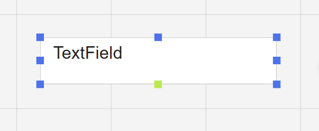
Textfield

textfield

Input component capable of displaying and editing values. It can bind to PropertyInstance objects through BindPoints or operate as a standalone value container.

Style Block sxTextField
Required
guidTypeNamexywh
Extra Props
isSxEditableElemisNoResizeElemisNoColorElemisNoMoveElem
Style Props
positiondisplaytextAlignalignItemsflexDirectionjustifyContentpaddingborderborderRadiusfontSizefontFamilyfontWeightlineHeightcolorbackgroundColorplaceholderplaceholderColorplaceholderOpacitymultilinerowsopacityoverflow
Defaults
Type: "Textfield" Name: "Textfield" Value: "TextField" w: "250" h: "50" backgroundColor: "#66f579ff" multiline: "false" rows: "1"
DISPLAY

Label

label

Display component used to render values from PropertyInstance bindings or to present static content. Unlike Textfield, it does not provide value editing capabilities.

Style Block sxLabel
Style Props
colorbackgroundColorfontSizefontFamilypaddingborderdisplayjustifyContentalignItemsfontWeighttextTransform
Defaults
Type: "Label" Name: "Label" Value: "Label"
ACTION

Button

button

Action component that emits signals through BindPoints and Anchors. Its behavior depends on connected components and configured bindings. A common use case is triggering Viewport navigation, data operations, or workflow execution.

Style Block sxTextField
Defaults
Type: "Button" Name: "Button" Value: "Button" w: "50" h: "50"
MEDIA

Image

image

Media component used to display images stored in the backend through a referenced URL.

Style Block sxProperty
Required
urlimgNameimgGuid
Defaults
Type: "Image" Name: "Image" Value: "Image"
LAYOUT

LayoutRow

layoutrow

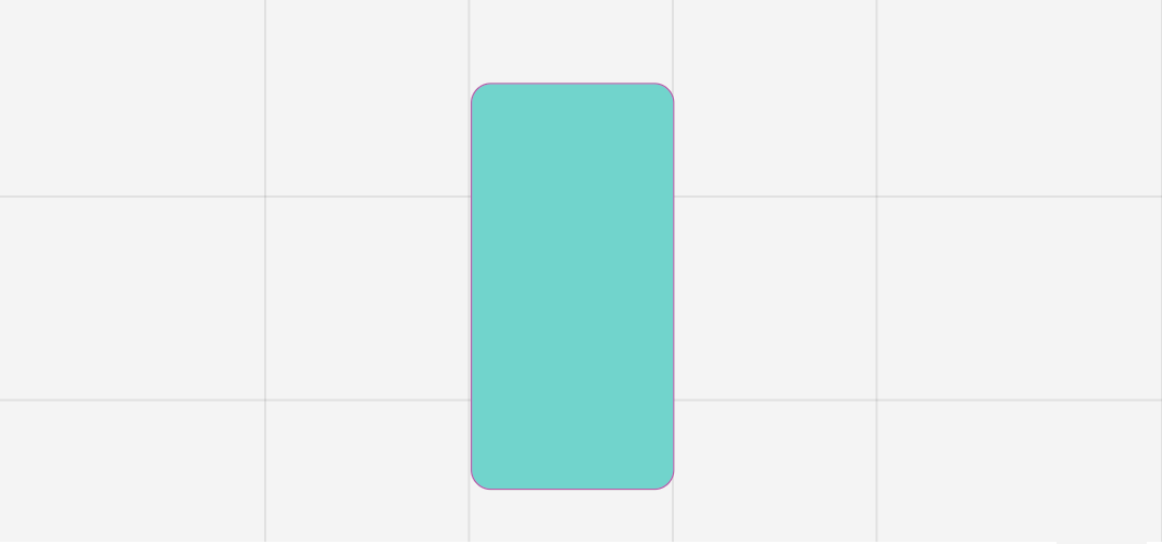
Layout container that arranges child components horizontally using a row-based flex layout.

Flags layout: true
Style Block sxProperty
Enforced
display: "flex" flexDirection: "row"
Defaults
Type: "LayoutRow" Name: "LayoutRow"
LAYOUT

LayoutColumn

layoutcolumn

Layout container that arranges child components vertically using a column-based flex layout.

Flags layout: true
Style Block sxProperty
Enforced
display: "flex" flexDirection: "column"
Defaults
Type: "LayoutColumn" Name: "LayoutColumn"
LAYOUT

GridLayout

gridlayout

Experimental layout container intended for future gallery and grid-based rendering scenarios. Planned to provide functionality similar to list-based visual collections.

Style Block sxProperty
Enforced
display: "flex"
Defaults
Type: "GridLayout" Name: "GridLayout"
CONTAINER

UniversalElem

universalelem

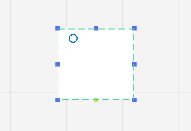
Generic visual container used as the foundation for custom user interface composition. It provides configurable styling and layout capabilities for prototyping and screen modeling.

Style Block sxProperty
Defaults
Type: "UniversalElem" Name: "UniversalElem"
ROOT

Viewport

viewport

Root visual container representing an application screen. It acts as the positioning context for UI elements. During simulation, Viewports are typically transparent and are commonly combined with UniversalElem instances to define the screen's visual appearance.

Required
Device
Defaults
Type: "Viewport" Name: "Viewport" Device: "web" backgroundColor: "#ffffffff"
ROUTING

Outlet

outlet

Navigation target component used together with Viewports. When activated through a connected Button, it instructs the target Viewport to reposition and focus on the Outlet area, simulating screen transitions and navigation.

Defaults
Type: "Outlet" Name: "Outlet"
OVERLAY

Overlay

overlay

Modal positioning component that can interrupt normal navigation flow. When activated by an incoming signal, it repositions itself relative to the current canvas view, enabling dialog and popup simulation.

Required
isOverlayActive
Defaults
Type: "Overlay" Name: "Overlay" isOverlayActive: "false"
GRAPH

GraphSelect

graphselect

Selection component similar to a ComboBox. It can receive PropertyInstance bindings through BindPoints and display values from ClassInstance collections. The selected item can be emitted as a ClassInstance reference for downstream processing.

Required
selected
Defaults
Type: "GraphSelect" Name: "GraphSelect" selected: null
GRAPHLOGIC

CvGraphEval

cvgrapheval

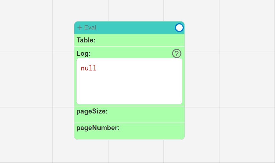
Advanced graph evaluation component intended for complex runtime calculations and graph-based processing. Currently under development.

Logic Props
cvValueList
Defaults
Type: "CvGraphEval" Name: "CvGraphEval" cvValueList: []
API

CvGraphApiBridgeComp

cvgraphapibridgecomp

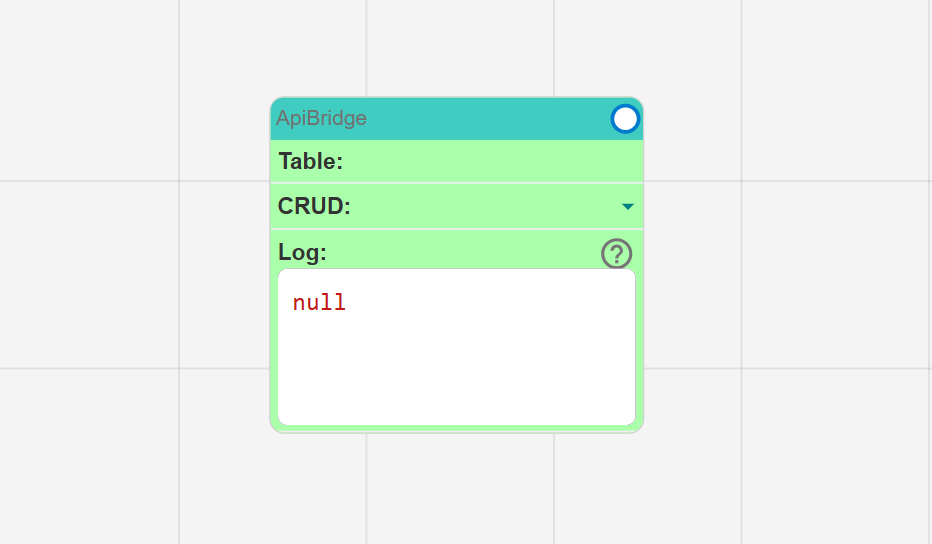
API integration component responsible for executing CRUD operations. It receives ClassInstance data through bindings and converts incoming values into API requests for querying, creating, updating, or deleting records.

Logic Props
TableCRUD
Defaults
Type: "CvGraphApiBridgeComp" Name: "CvGraphApiBridgeComp" Value: "ApiBridge"
LOGIC

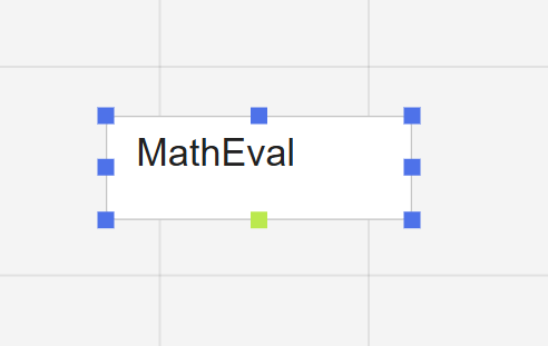
MathEval

matheval

Runtime calculation component used to evaluate expressions based on bound ClassInstance and PropertyInstance values. Calculations are triggered by value change events emitted from monitored properties.

Logic Props
evalCodemenucvInstanceList
Defaults
Type: "MathEval" Name: "MathEval" Value: "MathEval"
EVENTS

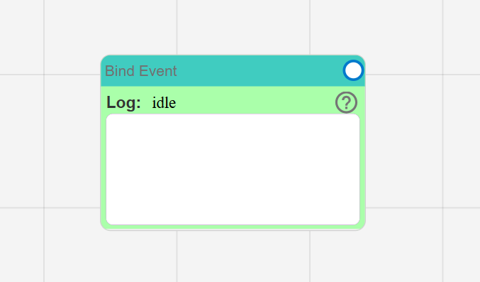
CvGraphBindEventComp

cvgraphbindeventcomp

Internal event-routing component generated from BindEmitter definitions. It is responsible for connecting event sources such as Buttons and ClassInstances to compatible target components.

Logic Props
cvValueList
Defaults
Type: "CvGraphBindEventComp" Name: "CvGraphBindEventComp"
FLOW

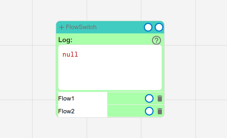
CvGraphFlowSwitchComp

cvgraphflowswitchcomp

Conditional flow controller that evaluates incoming PropertyInstance values and routes execution through different output Anchors. It is commonly used to implement conditional navigation, branching workflows, and dynamic screen transitions.

Logic Props
cvFlowItemListcvValuePropertyAnchor_input
Defaults
Type: "CvGraphFlowSwitchComp" Name: "CvGraphFlowSwitchComp"
FEEDBACK

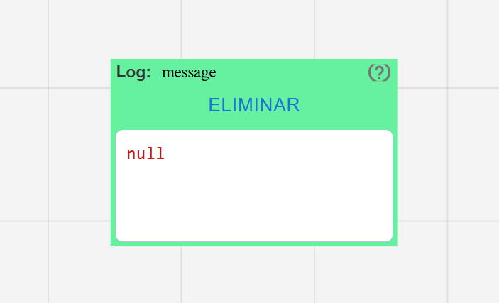
ViewMsg

viewmsg

Feedback component used to display messages received through the event and signal system.

Defaults
Type: "ViewMsg" Name: "ViewMsg"
LIST

ListInstanceLayoutElem

listinstancelayoutelem

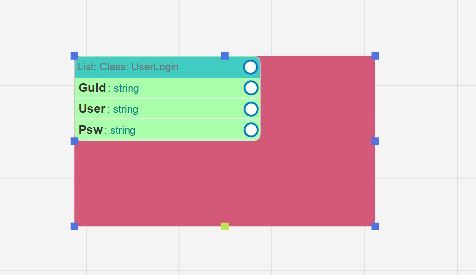
Rendering container responsible for visualizing the contents of a ClassListInstance. It applies a user-defined layout template to each item contained within the associated collection.

Flags layout: true
Logic Props
cvIsToggleOnheightToggleChioItem
Defaults
Type: "ListInstanceLayoutElem" Name: "ListInstanceLayoutElem" Value: "ListInstanceLayout"
VIEWER

ViewPlainObjectInstance

viewplainobjectinstance

Viewer component used to inspect ClassInstance, ClassListInstance, PropertyInstance, and PropertyListInstance objects.

Defaults
Type: "ViewPlainObjectInstance" Name: "ViewPlainObjectInstance"
INSTANCE INTERACTIVE CONTAINER

ClassInstance

classinstance

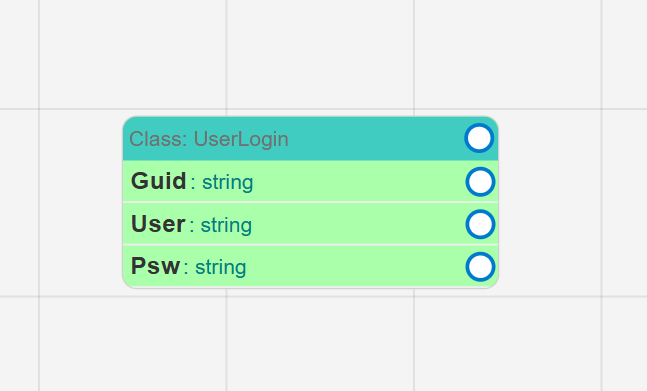
Runtime data container representing an instance of a class defined within the DTC. It acts as a globally accessible state object and contains PropertyInstance members that can be exposed through BindEmitters and connected to other components through BindPoints.

Defaults
Type: "ViewPlainObjectInstance" Name: "ViewPlainObjectInstance"
INSTANCE INTERACTIVE CONTAINER LIST

ClassListInstance

classlistinstance

Runtime collection container representing a dynamic list of ClassInstance objects. It provides synchronization mechanisms, supports template-based rendering through ListInstanceLayoutElem, and can be connected to other components through BindPoints for state propagation and instance management.

Defaults
Type: "ViewPlainObjectInstance" Name: "ViewPlainObjectInstance"
UTILITY

AutoGuid

autoguid

Utility component that generates a new GUID whenever it receives an activation signal. It behaves similarly to a Textfield while automatically managing unique identifier generation.

Behavior
Value must contain autogenerated guid.
Defaults
Type: "AutoGuid" Name: "AutoGuid"